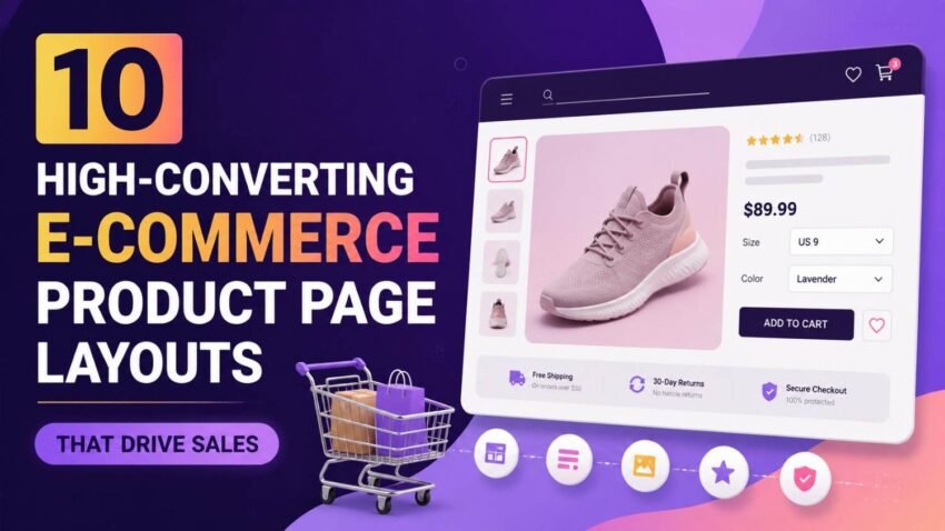
A lot of e-commerce companies spend a bunch on advertising, SEO, and social media marketing just to pull visitors in, but somehow a big chunk of them leave before they buy. Usually, the issue is not the product itself, or even the traffic source— it’s the product page. When the layout feels confusing, the product images look weak, the descriptions are a bit murky, or the trust signals are just not there, shoppers hesitate. That hesitation then chips away at customer confidence. And honestly even a slight tweak to your product page design can boost conversion rates by a lot, and bring in more income without touching your marketing budget. If your product pages don’t really steer people toward “add to cart”, you’re basically letting good sales slip away.
Online shoppers these days want pages that load quickly, navigation that makes sense, clear product details, genuine reviews, and a smooth buying process on every device. They’re looking for answers fast, plus reassurance before they commit. So the best brands go through each section of the product page like it matters, because it does, to reduce friction and nudge action. In this article we’ll break down 10 High-Converting E-Commerce Product Page Layouts That Drive Sales, showing how each layout works, when it fits best, and why it strengthens the customer journey. Whether you run a small store, or you’re managing a bigger e-commerce brand, these layouts can help you improve engagement, build trust, and lift conversions.
Why Product Page Layout Matters
A product page is basically your digital salesperson, it sort of sells for you. It introduces your item , answers the usual customer worries, builds confidence, and pushes buyers to finish their purchase. Even a really great product can still have trouble getting traction if the layout makes key details hard to spot or if it throws in distractions that you didnt ask for. A carefully arranged layout keeps people browsing, puts info in a sensible order, and cuts down on doubt along the whole buying path. Each part should guide the visitor, almost gently, toward the “Add to Basket” button while also strengthening their confidence in what they’re choosing.
1. The Classic above the fold kind of layout
One of the most useful product page layouts puts the most important stuff right up top, like at the very beginning without asking visitors to scroll. Usually you’ll see a big product image next to the product title, price, star rating, key benefits, stock status, and then a clearly visible call to action button. In other words customers get the gist fast, within just a few seconds, and they can tell what the item actually is and what it does. This works really well because it fits how people shop now. Online shoppers often decide in a blink whether to stay around or bounce off the page. When the essentials are shown immediately, there’s less uncertainty and it pushes users to keep looking. Brands selling electronics, apparel, home items, and everyday consumer goods often use this setup because it feels clean, familiar, and—honestly—like a shopping experience people already understand.
2. The storytelling product page setup
Instead of only listing technical specs, storytelling layouts show, more like, how the product improves the customer’s life. After the product is introduced, the page slowly moves through realistic moments, practical advantages, what customers actually experienced, and also the emotional side of it, before getting into the features. This style tends to work especially well for premium products, lifestyle brands, wellness items, luxury goods, and direct to consumer businesses, where buying choices are heavily nudged by feeling rather than just logic. When customers can picture themselves using the product, storytelling boosts that emotional connection, and it makes the purchase decision feel more personal… and somehow more worthwhile.
3. Feature-to-Benefit Layout
A lot of businesses just throw up product features and then stop there, like ok you see it… but you dont really know why it helps you. A feature-to-benefit layout makes it work better, because it links each specification to some real customer advantage, so it feels less random. For example, instead of listing that a laptop has a “5,000mAh battery,” the page also says this means longer working hours, without all those constant recharges. Honestly, this kind of setup helps shoppers get the practical value, not make them play guess-the-meaning with technical details on their own. It works especially well for electronics, software, fitness equipment, business tools, and also products where people usually want a bit of context before they buy, not just a list of specs.
4. Image-First Visual Layout
Visuals tend to steer online buying decisions a lot, because customers can’t really touch , or inspect a product in person before ordering. Image-first layouts focus on large, crisp photos, 360-degree product views, close-up shots, lifestyle scenes, and even demonstration videos, so the product is shown from different angles instead of one flat view. The written part is kept short, almost like it supports what the media is already saying. This approach is great for fashion brands, furniture stores, beauty companies, and home décor businesses, because customers often rely on appearance and vibe when they decide. When you pair professional photography with zoom, it builds confidence, and it also reduces uncertainty.
5. Customer Review-Centred Layout
Trust matters a lot for e-commerce success, particularly for first time visitors who don’t really know your brand yet. Review-centred layouts bring customer ratings, testimonials, user generated photos, verified purchases and even frequently asked questions all through the product page, instead of tucking them away near the bottom like an afterthought . When you show real customer experiences right next to the product details, it helps calm that “am I making the right choice” feeling , while also offering an outside check. Shoppers tend to relax faster when they see positive outcomes from people with similar needs, and then they’re more willing to go ahead with the purchase. Companies that sell health related products, consumer electronics, beauty items, and household goods often see better conversions using this trust first, experience heavy method.
6. Comparison Based Product Layout
A lot of shoppers end up comparing several products before they commit to one. A comparison based layout makes that step easier by clearly showing what your featured option does differently from other models or competing alternatives . Rather than making people leave your site to compare stuff elsewhere, the page keeps everything together with side by side comparisons inside the buying journey.
This layout can lower decision fatigue , and it helps customers pick the option that actually fits their needs. Tech brands, software companies, appliance makers, and subscription providers often include comparison sections to boost purchase confidence and at the same time reduce abandoned shopping carts .
7. Mobile-First Product Page Layout
With mobile commerce still growin g each year, product pages really need to be designed mainly for phone users rather than those desktop visitors who click around slowly. Mobile-first layouts, like you’d expect, prioritise quick loading speeds, simpler navigation, big touch-friendly buttons, compressed images, and often a sticky “Add to Basket” button so people don’t have to scroll for ages. The content is also more concise so it stays easy to scan on the smaller screens, even when someone is half distracted. Optimising for mobile helps user experience as well as search performance. It also tends to push conversions higher among customers browsing on mobile devices. In other words, a responsive, mobile friendly design has become a must-have part of successful e-commerce and not just a “nice-to-have” kind of upgrade.
8. Question and Answer Layout
Customers often pause because they still have unanswered matters after reading the product description. A question and answer layout helps upfront by placing a detailed FAQ area directly on the product page, so it feels like the page is talking back to them. Instead of making visitors message customer support, this format immediately covers common things like sizing, compatibility, delivery, warranties, setup, maintenance, and returns. By reducing uncertainty, the buying journey gets shorter, and customer satisfaction usually goes up. It also supports SEO, since it naturally covers long tail questions people type when they are considering a purchase, like they are asking a real human.
9. Video Driven Product Page Layout
Product demonstration videos are one of the best approaches for showing value online. A video-driven layout mixes normal product information with demonstration videos that clarify how the item works, draw attention to key features, and show real world usage, not just polished marketing claims. Videos provide context that static images cannot always capture. Customers gain a clearer understanding of product size, functionality, movement, and quality before making a purchase. Educational demonstrations, tutorials, and unboxing videos are especially effective for electronics, fitness equipment, tools, and kitchen appliances.
10. Trust-First Conversion Layout
Even when customers like the product, some uncertainty around payments, returns, or delivery timings can stop them from finishing the buy. With a trust-first kind of layout, reassurance is sprinkled across the product page, not only after you reach checkout, like, you know, too late. Things like visible security badges, delivery details that are actually specific, a transparent return policy, warranty info, payment options you can see upfront, and customer support that feels reachable all cut down the perceived risk. And when these are paired with real customer reviews plus a clear explanation of what they’re getting, the whole page feels calmer, so visitors are more likely to say yes and complete the purchase with confidence.
Essential stuff Every High-Converting Product Page Should Have
No matter which layout you pick, certain parts tend to lift conversion rates across almost every industry. High-resolution images, easy to spot product titles, descriptions that persuade, accurate pricing, call-to-action buttons that stand out, customer reviews, delivery information, return policies, plus mobile friendliness should all work in sync to make the shopping journey feel less annoying and more friction-free. Search engines and AI-powered recommendation systems also increasingly reward pages that show expertise transparency, and genuine user satisfaction. Better, more complete product information doesn’t just help shoppers decide, it also strengthens your site’s overall authority.
Common Product Page Mistakes That Reduce Sales
Many online stores, kind of unknowingly, lower conversion results by pushing visitors with too much info that doesn’t even matter to them, or by hiding the stuff people actually need. Think about low quality product images, descriptions that feel vague or “almost there”, slow page load times, confusing navigation paths , unclear pricing, and checkout flows that are oddly difficult. That combination often creates real frustration, and shoppers simply give up and abandon the cart. If a store avoids constant pop ups, keeps branding steady, writes descriptions that actually inform , and makes sure every important question gets answered before checkout, then customer confidence tends to grow. Over time that usually means better conversion rates, not just short term clicks.
How AI Is Influencing Modern Product Page Design
Artificial Intelligence is now influencing the way e-commerce teams improve product page design. AI tools can analyse customer behaviour, suggest personalised items, craft product descriptions, estimate purchasing intent, and even handle A/B testing for layouts automatically. With machine learning, businesses can figure out which design elements tend to work best for different audiences, while also refining the page continuously based on real interactions from customers, not guesses. And as AI powered shopping assistants and search experiences keep evolving, companies that build clear, believable, and genuinely helpful product pages will likely be shown more often in AI generated suggestions. In other words pages that mix strong User Experience (UX), transparent information, and practical content are more likely to do well, both in traditional search engines, and in newer AI search platforms too.
Best Practices for Building High-Converting Product Pages
Sure , every business is a little different,with its own sort of needs , but most strong product pages kinda tend to stick to a handful of principles that already work. Try to cover what customers will wonder about, even before they ask, make the value obvious instead of only showing features, optimise each page so mobile users do not get a bad experience , build trust using real and honest reviews, and keep loading times quick. Then keep an eye on analytics, run tests on different page layouts, and tweak everything according to what customers actually do,not what you assume. These small, incremental changes often turn into big long term jumps in Online Sales , and the overall health of the business.
Conclusion
A good E-Commerce Product Page really does more than just show a product. It creates trust, explains why the offer matters, answers customer questions, and gently leads people toward finishing the purchase. Whether you go with a more narrative style, an image-first setup, a design that leans on reviews, or a mobile-first experience, the most successful product pages still seem to agree on the same priorities: clarity, easy navigation, and customer confidence. When companies combine thoughtful Product Page Design with solid Conversion Rate Optimization,plus a great User Experience (UX), they can increase engagement, lower cart abandonment, and keep pushing online sales up. And as customer expectations keep shifting, putting time into well structured, informative, and trustworthy product pages will stay one of the better ways to grow any e-commerce business.
Frequently Asked Questions
1. What makes a product page convert more customers?
A high-converting product page combines clear product information, high-quality images, customer reviews, trust signals, fast loading speeds, and an easy purchasing process that removes hesitation.
2. Why is mobile optimisation important for e-commerce product pages?
Most online shoppers browse and purchase using smartphones. A mobile-friendly layout improves usability, reduces bounce rates, and increases conversion opportunities across all devices.
3. Should product pages include customer reviews?
Yes. Authentic customer reviews build trust, provide social proof, answer common questions, and help new buyers make informed purchasing decisions.
4. How can AI improve e-commerce product pages?
AI helps personalise recommendations, optimise layouts, generate product descriptions, analyse user behaviour, and identify opportunities to improve conversion rates based on customer interactions.
5. Which product page layout is best for increasing sales?
There is no single best layout for every business. The most effective design depends on your products, target audience, and customer journey, but pages that prioritise clarity, trust, and user experience consistently deliver stronger conversion rates.