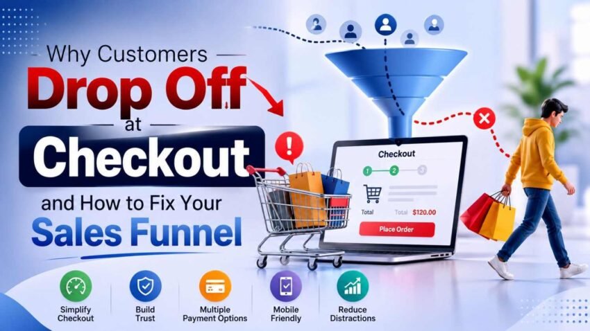
Getting customers to your website is only half the battle. A visitor might find your product, skim the description, compare options, drop an item into the cart, and still walk away without finishing the purchase. And yeah, this can be super frustrating for e-commerce businesses , because the customer has already shown real buying intent. A complicated checkout, unexpected costs, limited payment options, slow pages, or simply not enough trust can turn a nearly completed sale into a missed opportunity .
The good news is that checkout abandonment is often fixable. Rather than just going after more visitors, businesses can look closely at every stage within the sales funnel optimization process and figure out where potential buyers start losing confidence or energy. When product pages get improved , when checkout gets simplified, when fees are made clear upfront, when trust is strengthened, and when unnecessary friction is removed, you end up with a smoother customer journey, and more chances to convert existing traffic into revenue.
What Is Checkout Abandonment?
Checkout abandonment happens when someone starts the purchasing process but then goes away before finishing the transaction. This is not the same thing as a person who just visits a website and leaves, because that visitor has shown a weaker signal of intent. In other words, the shopper in checkout abandonment has already crossed a more convincing line, so leaving feels more like a hiccup in the journey than a casual stop.
Common examples include:
- Adding a product to the cart but leaving.
- Starting checkout but not entering payment details.
- Entering shipping information but abandoning before payment.
- Reaching the payment page and closing the browser.
- Returning later but never completing the purchase.
Understanding where customers leave is the first step toward improving checkout conversion rate.
Why Customers Abandon Their Purchases
There is, like rarely one universal reason behind every abandoned checkout. Different customers have different concerns, and they might not even agree with each other. One person may walk away because shipping is expensive, while another might dislike having to create an account. Someone else may hit a payment failure, or just get distracted mid way through the form . So businesses therefore should look at checkout abandonment as a mix of possible friction points rather than a single trouble spot.
1. Unexpected Costs Show Up at Checkout
One of the biggest causes of abandonment is when shoppers realize extra costs late in the buying process. A product might seem inexpensive on the product page, but shipping taxes, handling charges or other add ons can push the total price way up by the time they reach the final screen.
How to Fix It
Make important costs visible earlier in the journey.
- Show estimated shipping costs on product pages.
- Display taxes where appropriate.
- Avoid surprising customers with mandatory fees.
- Clearly communicate free-shipping thresholds.
- Show the final order total before payment.
Transparent pricing really helps, it builds a kind of trust and reduces that weird feeling that the customer thinks they’ve been nudged or misled.
2. The checkout flow is too long, like really.
Most people do not want to fill out extra forms just to buy a product. When the checkout takes forever, it adds friction, especially on mobile. Also when you ask for details that aren’t truly needed to finalize the order, the whole thing can start to feel unnecessarily elaborate or in other words, more complicated than it should be.
Improve the Checkout Experience
- Remove unnecessary form fields.
- Use address autocomplete where possible.
- Keep checkout steps clearly organized.
- Avoid repeating information.
- Provide a visible progress indicator when multiple steps are necessary.
- Allow customers to review their order without restarting the process.
A simplified checkout process can make the purchasing journey feel much easier.
3. Customers Are Forced to Create an Account
Mandatory account creation can feel kinda unnecessary barrier. Like, a customer who wants to do a quick purchase might not want to create a password, verify their email address , or provide extra information .
Offer More Flexible Options
Consider providing:
- Guest checkout.
- Social sign-in where appropriate.
- Optional account creation after purchase.
- One-click login for returning customers.
- Clear explanations of the benefits of creating an account.
The aim is basically to help customers finish the transaction by following the easiest reasonable route.
4. Your Website Does Not Seem Trustworthy
Customers are more cautious when they spend money online. If the site looks outdated, has broken pieces, feels thin on contact details, or gives only limited guidance about refunds and payments, people can stall or hesitate. Trust really matters here, especially when customers buy high price items or when they are sharing sensitive data.
Strengthen Customer Trust
- Display secure payment indicators where relevant.
- Provide clear return and refund policies.
- Include accessible customer support information.
- Show genuine reviews and testimonials.
- Keep product information accurate.
- Maintain consistent branding throughout the website.
- Make important policies easy to find.
These elements contribute to a stronger e-commerce conversion strategy.
5. The Website Loads Too Slowly
A slow website can damage the buying experience before customers even reach checkout. Every additional delay can increase frustration, especially for mobile shoppers using slower connections.
Improve Website Performance
- Compress large images.
- Reduce unnecessary scripts.
- Use browser caching.
- Optimize third-party tools.
- Remove plugins that are not needed.
- Monitor Core Web Vitals.
- Test checkout speed on real mobile devices.
Speed is not simply an SEO concern. It directly affects usability and the likelihood that customers will continue through the funnel.
6. Mobile Checkout Is Difficult
A checkout that works perfectly on desktop can still be frustrating on a smartphone. Small buttons, difficult forms, excessive scrolling, and poorly positioned payment options can make mobile purchasing unnecessarily difficult.
Make Mobile Checkout Easier
- Use large, touch-friendly buttons.
- Keep forms short.
- Use appropriate mobile keyboards.
- Make important information readable.
- Avoid unnecessary pop-ups.
- Keep the checkout layout simple.
- Test the complete purchase journey on multiple devices.
Since many online purchases begin or occur on mobile devices, mobile checkout optimization should be treated as a core conversion activity.
7. Customers Cannot Find Their Preferred Payment Method
Customers may reach checkout and discover that their preferred payment option is unavailable.
This can be especially problematic in markets where shoppers commonly use several payment methods.
Offer Relevant Payment Options
Depending on your market and business model, consider:
- Credit and debit cards.
- Digital wallets.
- Bank transfers.
- Buy-now-pay-later options where appropriate.
- Local payment methods.
- Cash-on-delivery where commercially suitable.
However, adding every possible payment method is not automatically better. Too many choices can create confusion.
Offer the payment methods your target audience actually uses.
8. The Return Policy Is Unclear
Customers often want to know what happens if the product does not meet their expectations. An unclear return policy can create purchase anxiety.
Make Returns Easy to Understand
Your return information should explain:
- How many days customers have to return products.
- Which products qualify.
- Who pays return shipping.
- How refunds are processed.
- What happens with damaged products.
- How customers can contact support.
A straightforward policy can remove uncertainty at the exact moment when a customer is deciding whether to purchase.
9. Customers Are Unsure About Shipping
Shipping information should not become a mystery at checkout. If customers do not know when their order will arrive, they may postpone the purchase or compare another seller.
Improve Shipping Communication
- Show estimated delivery dates.
- Clearly state shipping charges.
- Explain free-delivery conditions.
- Mention available delivery locations.
- Provide tracking information after purchase.
- Avoid promising delivery speeds you cannot consistently achieve.
Clear expectations can reduce hesitation and improve the overall online shopping experience.
10. The Product Page Did Not Answer Important Questions
Sometimes checkout abandonment is actually caused by problems much earlier in the funnel. Customers may reach checkout while still wondering whether the product is right for them. If product information is incomplete, they may abandon the purchase to conduct additional research.
Improve Product Pages
Include:
- Clear product specifications.
- Multiple high-quality images.
- Product dimensions where relevant.
- Material or technical information.
- Availability information.
- Delivery estimates.
- Return details.
- Customer reviews.
- Frequently asked questions.
A strong product page can prevent uncertainty from reaching the checkout stage.
11. Too Many Distractions During Checkout
The checkout page should have one primary objective: completing the purchase. Navigation menus, promotional banners, unrelated recommendations, pop-ups, and excessive links can distract customers.
Create a Focused Checkout
- Minimize unnecessary navigation.
- Remove irrelevant promotional messages.
- Keep the order summary visible.
- Highlight the primary checkout action.
- Avoid interrupting customers with unnecessary pop-ups.
- Make error messages clear.
This is an important part of conversion rate optimization for e-commerce.
12. Customers Encounter Errors During Payment
Technical problems can instantly destroy a sale. A payment may fail because of an expired card, incorrect information, insufficient funds, a temporary gateway problem, or an integration issue. The customer may not know whether the problem is with their card or your website.
Build Better Payment Recovery
- Explain payment errors clearly.
- Do not erase information already entered.
- Offer alternative payment methods.
- Allow customers to retry easily.
- Monitor payment failures.
- Test payment gateways regularly.
- Provide customer support for unresolved issues.
A useful error message should tell customers what happened and what they should do next.
13. Customers Find a Better Deal Elsewhere
Customers can compare prices almost instantly. If competitors offer a similar product with lower prices, free shipping, better guarantees, or stronger reviews, customers may leave your checkout.
Compete Beyond Price
You do not always need to become the cheapest seller.
Instead, strengthen your overall value proposition through:
- Better customer service.
- Faster delivery.
- Stronger warranties.
- Better product quality.
- Exclusive bundles.
- Loyalty rewards.
- Helpful educational content.
- Easier returns.
The customer should understand why buying from you is worthwhile.
14. Your Sales Funnel Has Too Much Friction
A sales funnel should slowly, move people from awareness into the next things like consideration, intent ,and purchase. But if each phase adds some unnecessary friction, customers might just wander off and disappear before they ever get to checkout . It’s kind of like too much added delay at the wrong time, causes the whole stream to lose them, even if the offer was fine.
Examine Every Funnel Stage
Ask:
- Does the landing page clearly communicate value?
- Is the product easy to understand?
- Are objections addressed?
- Are reviews visible?
- Are prices transparent?
- Is the checkout simple?
- Are payment options convenient?
- Can customers easily get help?
Fixing the checkout alone may not solve a problem that actually begins at the top of the funnel.
15. Use Analytics to Find the Exact Drop-Off Point
Guessing is not an effective conversion strategy. Analytics can show where customers leave your funnel.
For example, you may discover that:
- 80% reach the cart.
- 60% begin checkout.
- 40% reach payment.
- Only 25% complete the purchase.
That information gives you a starting point for investigation.
Track Important Funnel Events
Monitor:
- Product views.
- Add-to-cart events.
- Cart views.
- Checkout starts.
- Shipping-information completion.
- Payment attempts.
- Successful purchases.
- Payment failures.
- Coupon usage.
This makes sales funnel analysis much more actionable.
16. Test One Major Change at a Time
Businesses sometimes redesign their entire checkout and then cannot determine which change actually improved performance. A better approach is controlled testing.
Try A/B Testing
Test different versions of:
- Checkout page layout.
- CTA wording.
- Guest checkout placement.
- Shipping information.
- Product descriptions.
- Trust messaging.
- Payment options.
- Discount presentation.
The goal isn’t to make the checkout look different, really the goal is to pin down which tweaks, in a measurable way, lead to improvements.
17. Use cart abandonment messages carefully
Not every abandoned cart means you lost someone forever. Sometimes shoppers are just digging around, comparing, waiting for payday, or, honestly getting distracted. A properly timed nudge can bring some of those people back, though.
Make Abandonment Emails Useful
- Remind customers what they left behind.
- Include the product image.
- Make returning to checkout easy.
- Address common concerns.
- Avoid excessive messaging.
- Personalize the communication where appropriate.
Discounts should not always be the first solution, because repeated deals sort of teach people to wait, like “maybe later” and then , purchase won’t happen now.
18. Upgrade your Call to Action
Your checkout button needs to say what comes next, in a way that feels obvious. If the wording is generic or a little confusing, it can bring unnecessary doubt. Rather than using unsure labels, pick action focused phrases, so customers understand the next step right away.
Examples include:
- “Complete Purchase”
- “Place Order”
- “Pay Securely”
- “Confirm Order”
The CTA should stand out visually without overwhelming the rest of the page.
19. Make the Value Proposition Obvious
Customers should understand why they should purchase from you. Your value proposition should answer three basic questions:
What are you offering?
Why is it useful?
Why should customers choose you instead of another option?
This note needs to show up before checkout and stay consistent like the whole purchase path. A solid e-commerce sales funnel doesn’t rely on too much pushy persuasion, it’s more about easing confusion and making the customer’s choice feel way simpler. It reduces uncertainty , so the decision doesn’t feel heavy or complicated.
20. Create a Checkout Optimization Checklist
Before changing your funnel, conduct a complete checkout audit.
Check whether:
- Prices are transparent.
- Shipping costs are visible.
- Delivery estimates are clear.
- Guest checkout is available.
- Forms are short.
- Mobile checkout works properly.
- Payment methods are relevant.
- Return policies are easy to find.
- Trust signals are visible.
- Error messages are understandable.
- Pages load quickly.
- Analytics track every major step.
Small improvements across several areas can collectively create a meaningful increase in conversions.
A Simple Strategy to Reduce Checkout Abandonment
You do not need to fix everything simultaneously. Start with the areas that can have the greatest impact.
Step 1: Identify the Biggest Drop-Off
Use analytics to determine where customers leave.
Step 2: Understand the Reason
Use surveys, customer support conversations, session recordings, reviews, and usability testing to identify potential causes.
Step 3: Remove Friction
Simplify forms, clarify costs, improve speed, and strengthen payment options.
Step 4: Test the Change
Run an A/B test whenever practical.
Step 5: Measure the Result
Compare checkout completion, revenue per visitor, cart abandonment, and other relevant metrics.
Step 6: Continue Improving
Conversion optimization should be an ongoing process rather than a one-time website project.
Conclusion
Customers rarely walk away from the checkout for only one reason, it is usually something like a cascade. Unexpected costs , those fiddly forms, weak trust signals, slow pages, payment options that feel limited, unclear shipping policies, random technical errors, or even simple distractions at the moment can all quietly add up to lost sales. The best way forward is to see the whole customer journey as one connected system and then figure out where the friction really shows up. With analytics in place , checkout simplified, costs communicated clearly, mobile usability improved, trust strengthened, more relevant payment options provided, and then improvements continuously tested, businesses can win back more potential customers without just dumping extra money on traffic. A properly optimized funnel doesn’t push people to buy—it simply removes enough reasons to leave.
Frequently Asked Questions
1. Why do customers abandon checkout?
Common reasons include unexpected costs, complicated checkout forms, forced account creation, payment problems, slow websites, unclear returns, and lack of trust.
2. How can I reduce checkout abandonment?
Start by simplifying checkout, showing total costs early, offering guest checkout, improving mobile usability, providing preferred payment methods, and making policies clear.
3. What is checkout conversion rate?
Checkout conversion rate measures the percentage of customers who begin the checkout process and successfully complete their purchase.
4. Should I offer discounts to abandoned-cart customers?
Discounts can recover some sales, but they should not be the only strategy. First identify why customers abandon their carts and remove unnecessary friction.
5. How do I know where customers leave my sales funnel?
Use analytics to track product views, add-to-cart actions, checkout starts, payment attempts, and completed purchases. This helps identify the exact stage requiring optimization.